Maps and conflict
A new map dataset has been created and is available here.
Maps are inherently biased. When conflict researchers use maps, they need to understand the factors which have influenced the cartographer. When conflict researchers create their own maps, they need to accept that they too may be introducing biasing factors, albeit unwittingly.
|
 |
|
The Earth represented in three dimensions |
|
The Earth represented in two dimensions |
'True' maps cannot be created. Compromises are always necessary. These compromises introduce bias.
With inverted commas at the
ready, Harley makes the claim that "[t]he object of mapping is to produce a 'correct' relational
model of the terrain" (Harley, 1989: 4). There are two main reasons why such a 'correct' model can
never be achieved: i) the world is not flat; ii) biases/ misrepresentation.
The first problem is quite straightforward. The world is a sphere (or geoid, more formally)
while maps are drawn on flat pieces of paper. Representing a three dimensional object on a two
dimensional plane inevitably requires some form of modification. It is for this reason that
Monmonier argues that "[n]ot only is it easy to lie with maps, it's essential" in his aptly named How
to Lie With Maps (1991: 1).
There are many different ways in which a sphere or portions thereof can be represented on a
flat piece of paper: these different methods are the different map projections (Monmonier's "white
lies"). Different projections can be critiqued for different reasons. The squabbling behind the
creation of new map projections, however, indicate that the acceptance of new forms of map
representation may have as much to do with personal rivalries as cartographical value. The
Mercator projection of Gerhardus Kramer (1512-94) was of great benefit to navigation, but to
become so, it had to modify scale and therefore size of landmasses (Black: 29-30). The Peters
projection (named after Arno Peters and sometimes referred to as the Gall-Peters projection by map
publishers who feel that Peters had not given due regard to the 1855 map by the Reverend James
Gall) had the aim of giving greater representation to equatorial regions; Monmonier argues that the
success of the Peters projection is as much to do with its representation of Africa, Asia and South
America as it is to do with Peters' calling of a press conference to announce his projection: Peters
"knew how to work the crowd... [he had written] a doctoral dissertation on political propaganda,"
leaving academic cartographers "puzzled and enraged" (Monmonier 1991: 97-8). Wood (1992)
argues that the maker of another projection, Robinson, was "the leading voice in a perfidious and
vitriolic attack" on the Peters projection and also suggests that one of the reasons for the National
Geographic adopting the Robinson projection was that its chief cartographer, John Garver, was a
former graduate student of Robinson (Wood 1992: 58).
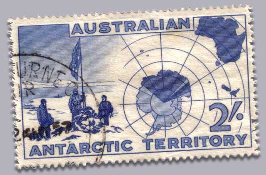
The map presented in the 1957 stamp (above) uses Zenithal Equidistant projection, a common projection to use when mapping polar regions. Yet note how the projection and positioning are being used to suggest Australian territorial sovereignty.
This leads us into the second reason for why a 'correct' map can never be
achieved: biases/ misrepresentation. Harley suggests that mapmakers use "all the tricks of the
cartographic trade" to put forward their agenda; tricks such as "size of symbol, thickness of line,
height of lettering, hatching and shading, the addition of color"; he goes on to state that the process
of making a map involves stages such as "selection, omission, simplification, classification [and]
the creation of hierarchies..." (Harley 1989: 7, 14). In the stamp above, shading has been used to indicate common territory (note how New Zealand is also included in the same category), but selection and omission have also been used. In order to present Australia and only Australia as having a territorial claim, the map is off-centre: we therefore cannot see the considerably closer Argentina, which also has territorial claims over Argentina (Tierra del Fuego would appear somewhere between the base of the T and E in 'TERRITORY').
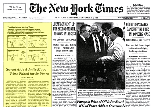
Harley's stages, however, are not sufficient to describe the processes involved in the
production of maps for the Soviet Union. On September 2, 1988, the Soviet Union's chief
cartographer, Viktor R. Yashchenko, in an interview with the government newspaper Izvestia
(quoted here in the New York Times), said that the Soviet Union had been falsifying its maps for
fifty years:
"Roads and rivers were moved," he said. "City districts were tilted. Streets and houses
were incorrectly indicated. For example, on the tourist map of Moscow, only the contours
of the capital are accurate." (New York Times, September 3, 1988: 4)
Bias cannot be removed from maps. As soon as a cartogropher puts pen to paper, compromises are made. This is no less true in the age of digital maps based on GIS and remote sensing technology. Indeed, such technologies introduce all sorts of new issues. Conflict researchers need to consider these issues whenever they use maps or map data in their research.
 but he does do